“A graphic designer with taste knows that less is more: that design is the servant of the written word” – William Zinsser, On Writing Well.
Your logo is one of the first parts of your brand that people see. That’s
why having a well-designed, simple logo is crucial for making a good
first impression.
A clean and simple logo is most effective in getting across your message. It’ll work well in most scenarios and be most memorable.
An overly complex logo is the opposite. They’re difficult to make work everywhere, and can confuse customers. This doesn’t mean complex logos cannot be beautiful and well done, but you should proceed with caution.
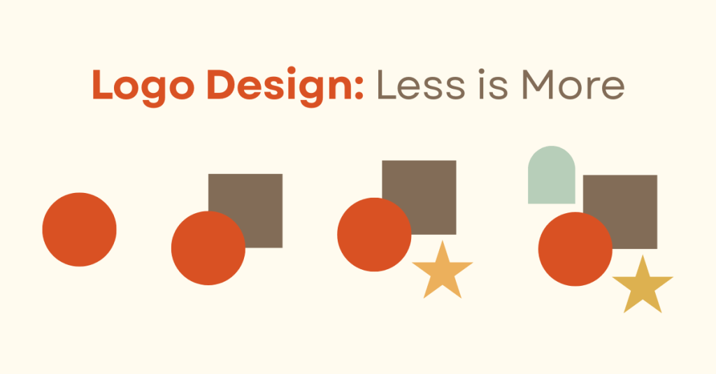
Elements of an Overcomplicated Logo
- Too many typefaces
- Illegible typefaces
- Too many graphic elements
- Unbalanced
- On-the-nose imagery
Memorability
Complex logos pose challenges for recognizability. According to Beefy Marketing, these logos are confusing and “can make it difficult for customers to remember your logo.” A logo is supposed to serve as a quick and easy way for people to recognize a brand. When a logo isn’t clean and simple, it can read as cluttered and confusing.
“Instead of making them feel connected to you,” says High Five Design Co., it leaves “them feeling less aligned or distanced from your practice.” A simpler logo is just easier to remember. It makes it easier for people to recall and connect with your brand.
Scalability
When designing a logo with multiple small details, one might not consider all the places in which the logo will be used.
The problem: Overcomplicated logos aren’t scalable. While the design may look fantastic, on a website landing page or a billboard, it won’t fare well
in smaller scenarios.
When the size of a logo is reduced, you lose smaller details. In places like profile pictures, small promotional items, and app icons, reducing the size of your logo to fit would make small details of your logo “indistinguishable,” says Vistaprint.
Responsive Logos
If you don’t want to say goodbye to a complicated logo design, responsive logos are your hero.
Responsive logos are when “your logo is also available in smaller sizes
and other variations,” according to Vistaprint. Aspects of the logo
are adjusted or removed to allow it to work in new scenarios. The
variation gets reworked as it is reduced until it is in its simplest
(but still recognizable) form.
This way, in those larger scenarios, you can keep your more detailed logo. When scaled-down details get muddy, switch to a logo variation better suited to the smaller space.
To create a memorable brand that sticks in customers’ minds and can easily work in most areas, use a simple logo. But, if you’re married to your complex logo, always create variations so the beautiful little details don’t get lost when scaling down. Create the logo that works best for your brand and the people who will see it.

Leave a comment