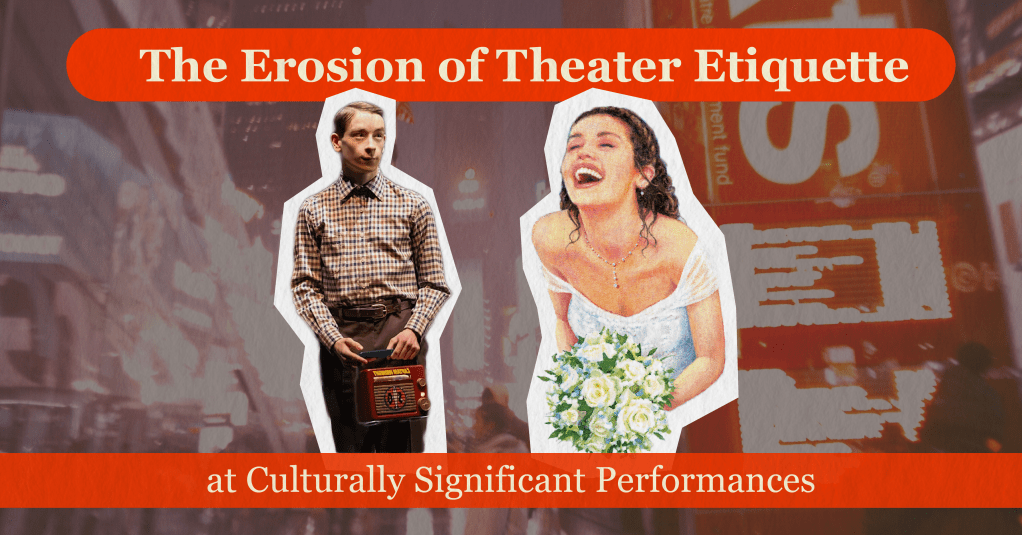
I have noticed a recent trend on Broadway. Theater goers aren’t following the rules, and the more significant a show is in pop culture, the worse it gets. Etiquette seems to be forgotten more and more with shows of this nature. From personal experiences to viral moments, I’ll be diving into this trend in my upcoming Medium.com article: The Erosion of Theater Etiquette at Culturally Significant Performances.
As I prepare to release my first long-form Medium article, I’m also working on some short-form promotional content for social media.
Note: All posts below are mockups and not posted to social media. Visuals may vary from the actual platform.
My Goals
- Maintain a consistent look throughout all my images
Ensures a consistent message across multiple platforms, maintaining engagement and eliminating confusion.
- Choose my post size that fills most of the screen.
Limits distractions from other posts that could cause the viewer to scroll.
Instagram Post
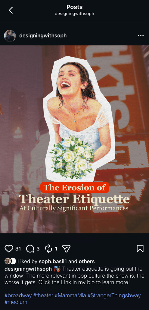
When posting on Instagram, I utilized Instagram’s standard 4:5 image size. I chose this size because it will allow you to see only one post at a time. Potential viewers will be less tempted to scroll as the next post will not be immediately visible to them.
For my caption copy, I started with an emoji to draw the reader’s attention to the bottom of the screen. Here they can find more information about the article and where to read it. I didn’t include a link to the article here since links are not clickable in Instagram captions. Instead, I added a CTA prompting people to check out the link in my bio.
I included five hashtags at the bottom, mentioning topics discussed in my article. This way, readers can learn a little more about what they’re in for when reading.
LinkedIn Post
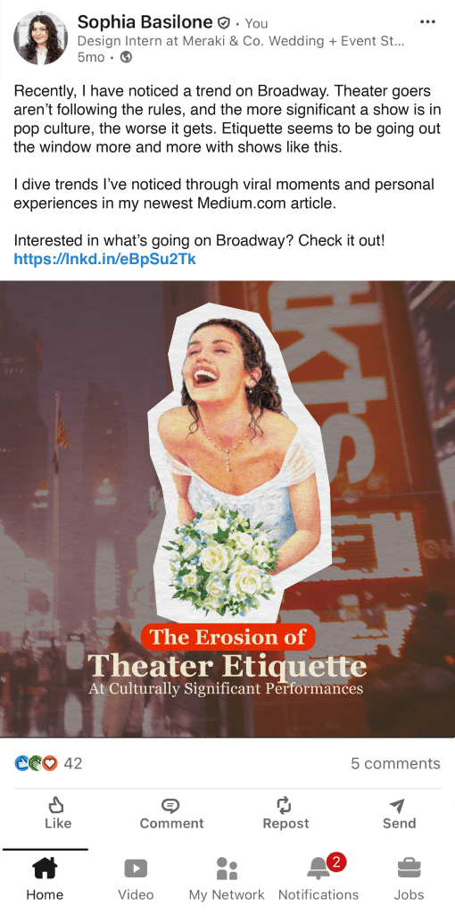
I used the recommended post size for LinkedIn, which is a square 1:1 ratio. This size takes up the most screen space. Other wider/shorter post sizes, while popular, would not fill the entire screen as I hoped.
Since LinkedIn’s main purpose is professional networking, posts tend to be more copy-heavy. I opted for small paragraphs of text, ending with a CTA and a link to the article. I kept the copy professional, very similar to what you read at the beginning of this article.
Threads Post
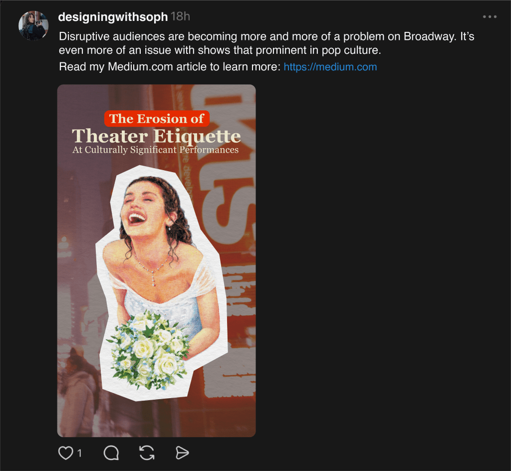
I am honestly not very familiar with threads, but decided to go with it over Twitter based on its average audience.
I chose a 9:16 ratio as this is what some sites recommended, although I am unsure if it is the optimal size. It does, however, accomplish my goal of filling the most screen space.
I swapped the layout of the image, having the text on top and image on the bottom. This filled the longer space more naturally.
I wrote my caption as a strong, opinion-based statement. Most of the content on Threads is formatted this way to encourage people to stop. A link is immediately visible after a CTA, so people click through and read on.

Leave a comment