If you have curly hair, you know the struggle of finding representation for your hair type in the beauty industry. Needless to say, it’s severely lacking. That’s why I’m setting out to make an icon set for curly hair.
This week, I began production on that icon pack.
What I’ve Accomplished
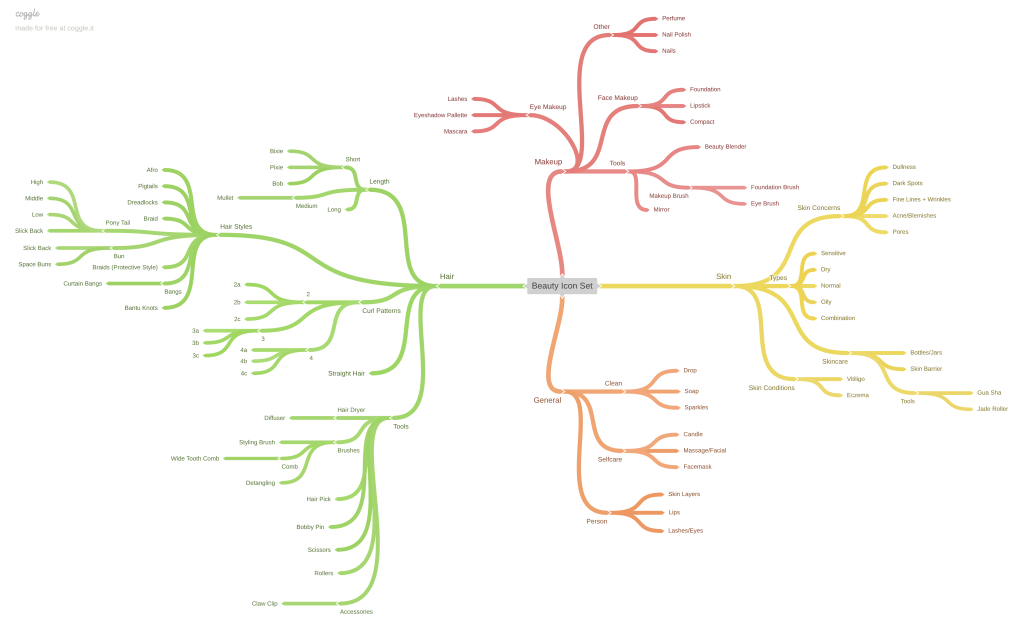
The first step in my process was to create a solid plan. Before I hopped into Adobe Illustrator to start designing, I needed to define exactly what icons I would be creating and what they would look like. To do that, I created a mind map, selected the icons I wanted to create from there, and began sketching.
Mind Map
I created my mind map in Coggle. Here, I was able to start with my central topic, a beauty icon pack, and branch out from there. I had four main branches in the mind map: hair, skin, makeup, and general.
In my hair branch, I defined each curl type, different hairstyles, lengths, and different hair tools. In the skin branch, I wrote out skin types, skin concerns, skin conditions, and different skincare terms and tools. For makeup, I branched off to face and eye makeup, various makeup tools, and other makeup-adjacent things like nail polish and perfume. Finally, for the general section, I, as you may have guessed, included more general overarching themed branches. This included a cleanliness branch with water drops and soap, a “person” branch with lips and eyelashes, and a self-care section with candles and face masks.
Selecting
After I dumped my brain into the mind map, it was time to select the icons I would create. To do this, I combed through each branch and picked out the most important ideas from each.
As I went through, I realized that I’d cast a very wide net with my icon selections. Perhaps too wide? I worried I wouldn’t be able to offer the amount of detail and variations I had envisioned if I kept my subject so broad. That led me to a pivot, but we’ll revisit that in a minute.
Sketching
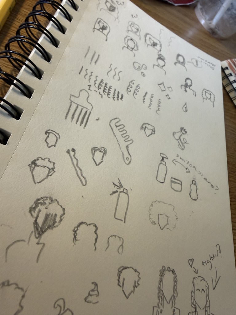
Before moving on to my final sketches, I drew some rough ones in my sketchbook. This helped me get the ideas out of my head and nail down what I wanted the icons to look like.
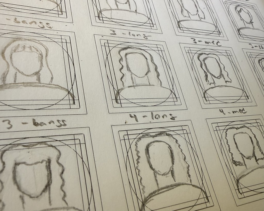
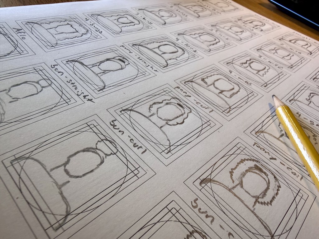
After my initial, messy sketches, I moved on to my final ones. These would be the sketches I will reference when I transfer them to the computer, so they needed to be super clean and accurate.
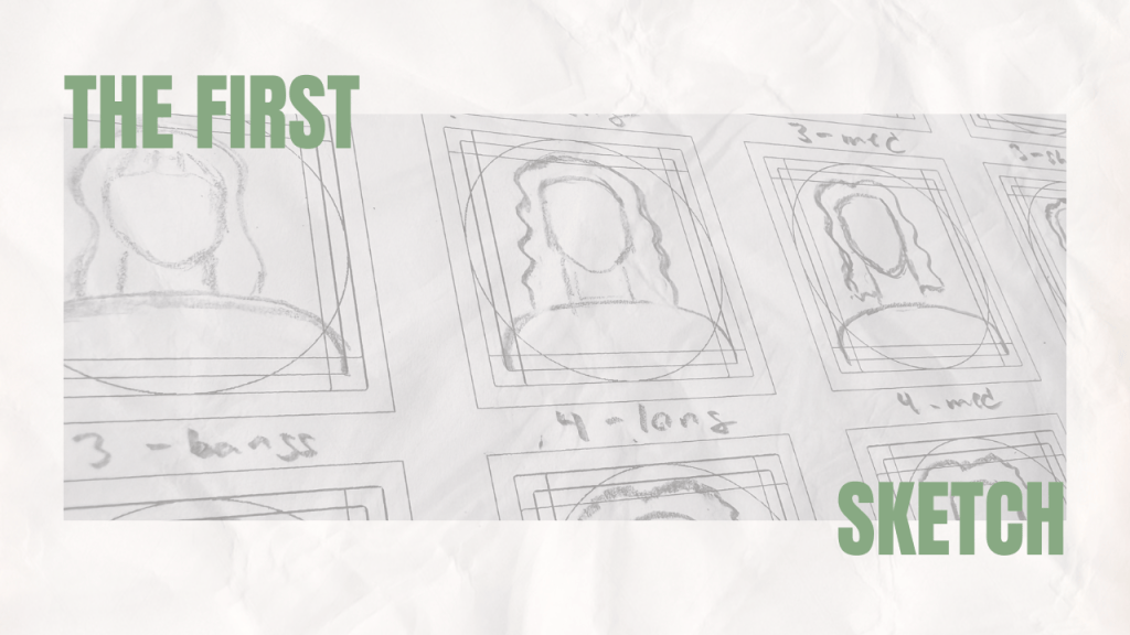
Since it’s my first time making an icon pack, I wanted my sketches to be a strong foundation. So, I watched a few videos from icon designers, watching their process. One of the most important things I learned is to use a grid to ensure icons are visually balanced. I downloaded a grid template from the creator jammed. These grids include space for a variety of icon shapes and sizes to ensure they were all visually balanced. It’s with this template that I created the final sketches for my icons.
Pivoting
My original idea for this icon pack was beauty. It would be overarching, including every hair type and skin type to maximize the number of people it could appeal to. As I made my selection, however, I realized that might not be the best way to go about this.
So, I decided to pivot. Instead of stretching myself thin, trying to include every little thing that could be in a beauty icon pack, I’m making it a little more niche. I’ve decided that for this icon pack I’ll focus on hair.
By switching to a narrower spread of icons, I can devote my time to making variations of each icon. This way, more people have more opportunities to see themselves in an icon. Each curl type will come with a few icon variations: a curl pattern icon, a person icon with short, medium, and long hair, and a variation with bangs. I’ll include a few different hairstyles, some of which will come with curl type variations. Finally, I’m including general icons, including tools like diffusers and picks, and more cleanliness-based icons like soap and water.
Moving to hair-only icons will let me focus on making high-quality hair icons that represent a wide variety of people. When I eventually sell this pack, I think it will be easier to market and stand out as a niche product.
Looking Forward
Next week I’ll be moving into Adobe Illustrator to vectorize my sketches, transferring them from concept to reality. I’m quite new to making icons, so we’ll see how this goes. Come back next week to find out!
View my product development journal below for a snapshot of my progress so far.

 Life: Designed
Leave a comment